theFERN – Marathon, Texas

Here are some pictures of Steven Jones’ progress on theFERN that he’s building in Marathon, Texas.

He is using SIPs panels from EH Systems (http://www.ehssips.com/) and their panels will be featured in the Easter Edition of Extreme Makeover Home Edition on ABC.
I’ll be posting more pictures and following Steven’s progress as he builds theFERN. I’ll also be uploading to our website more pictures and information for you to see.
The beauty of the SIPs is these exterior walls and roof panels were installed in two days.

The Lawrence Street House – LEED for Homes

We have officially registered our home with the US Green Building Council. This is the first step in pursuing LEED (Leadership in Energy and Environmental Design) Certification.

In addition to this registration, we hire a LEED rater — Earth Advantage from P-Town. Our local rater is Eli and he worked with us on theSAGE.
He is starting some preliminary calculations for the building shell (walls, floors, roof insulation and windows) so we can establish a baseline of where we’ll be for energy efficiency.
One concept we’ll be incorporating throughout is the idea that the most efficient heater, the most efficient light, the most efficient (insert item here) is the one you don’t have to use in the first place. This saves on many levels: initial cost (you don’t buy it), operating costs (you don’t use it) and maintenance costs (if it ain’t there, you don’t have to fix it).
I do have to insert here that there are some up front costs associated with some efficiency measures (extra insulation to reduce heating and cooling needs). But in the overall life-cycle cost of a home, only about 10-15% is the initial cost; virtually all of the rest (about 85%) is the operating and maintenance costs: paying for the energy to run the furnace or turn on the lights.
So we will be looking at efficiency measures up front. The house is already designed to take advantage of natural lighting and we’re looking at every other component with these efficiency measures in mind.
As an aside, I think we’re going to love our new neighborhood. Brenda and I went down last week to mow the weeds (trying to be a good neighbor), and met our soon-to-be neighbor, Jim. We had a very pleasant conversation with him and I’m sure we’ll enjoy living on Lawrence.
Stay tuned.

The Lawrence Street House – SDU (finally)

Finally. We have the design for our secondary dwelling unit (aka SDU). It’s amazing how challenging it has been to design a two-bedroom, one bath home in under 800 square feet.

City of Eugene code allows for a second dwelling on the same property if the lot is large enough (it is), if the owner of the property lives in one of the houses (we will) and the second house is no larger than 800 square feet (it comes in at a relatively lean 776 square feet).
Having the mindset of small homes and having done this before with theFERN plan, I thought this would be fairly straightforward. Was I wrong. theFERN is a generous 1,024 sq ft. It’s interesting when you get this small how every inch counts even more.
Our SDU is 250 sq ft SMALLER than theFERN. That’s the equivalent of a room 15 x 16 feet. Pretty large. And we still wanted two bedrooms.
After lots of pushing and pulling, reviews, sketches, redraws, redesign, hair-pulling, we feel we have a really good plan. It blends well with our main house and will have similar details. You can download a larger pdf version of the picture by clicking here.
I’m actually very happy with the way it laid out.
AND, we met with our Landscape Architect yesterday and he’s starting on the site/landscape. I’ll talk more about our design goals and philosophy about the landscape in a future post.

The Lawrence Street House – Refinements Pt 2

We have refined the exterior as well as the floor plan and are now very happy with every aspect of the design. Click here for a larger image of the south elevation.

We’ve added arbors over the south windows at the living room and over Brenda’s potting bench area off the garage. The front porch is reminiscent of the Craftsman Bungalow houses from the early 1900s. We want to blend in with the rest of the neighborhood. We also want to capture the front porch concept that is missing in our culture. More on that later; this is something stirring deeply in us.
I’m also meeting in a couple of days with our LEED Rater to get started on our LEED certification. And, I’m now starting on the design for the Secondary Dwelling Unit that will be located along 15th by the alley. More as that progresses, too.
We’re getting more and more excited about our new home!

The Lawrence Street House – Refinements

The design is progressing. We’ve been in the refinement stage of design development, taking the thoughts and ideas that came out of our design charrette and massaging the design.

We’ve been working 3D and in plan together; that’s always a good thing. Many designers start by getting the plan worked out then “forcing” an elevation on it. That’s dangerous and can lead to amazingly mediocre design.
We work in plan and 3D at the same time, going back and forth, thinking about how a change might affect the exterior as well as how the spaces work.
One thing that came out of all this is a relatively major rearranging of our bath/utility core. Primarily this was due to walking out of the Master Bedroom and looking right into the Main Bath and the double doors into the house from the Garage (one in the Utility and one into the Kitchen). We looked at a way to improve both of those layouts and the attached picture shows where we’re ending up.
Utility: is close to the kitchen door, so coming in from working in the yard will be less obtrusive (I think we’ll have a bench in the Garage to remove shoes at least). Nice linen closet and ironing board. We’ve moved the water heater into the ceiling space above the Utility (with a drain pan) which will be insulated and adjacent to the furnace. Nice folding counter over the washer and dryer.
Main Bath: is now even a little more private from the rest of the house. By moving it where we have it, not only do we not come out of the Master Bedroom and look into the Bath, we have a great wall for artwork there and probably will do a shallow recess niche to accentuate that wall.
Master Bath: much better storage (a huge linen), nice window over the toilet and still have our large shower.
Glass Block and Natural Light: we have tried various ideas to get natural light into the interior rooms (Main Bath and Utility). Some of my initial ideas involved translucent ceilings and skylights, but simpler is always better and did prevail. You may notice on the plan small openings at the master shower and the Main Bath tub. These are glass blocks as thru-wall “windows”. The one into the Main Bath tub is a vertical stack of blocks and the one at the shower is a horizontal row just above the counter in the Utility. This will allow borrowed light from the Master Bath to filter into the interior rooms. And, if you’re concerned about privacy, they make glass blocks with filter inserts which allow the light and maintain privacy.
We’re refining the exterior, too and I’ll post that soon.

The Lawrence Street House – Design Development

>Well, the charrette spurred some creative juices, as I mentioned. I’ve spent the last few days refining some things and developing the plan a little further. Refining it a little more. Tweaking it. Making it better.

The last sketch was an exterior idea, very rough. I’ve refined it a bit more and put a little color to it. Amazing what the 3D modeling, sketch paper, a little PhotoShop and some time will produce.
We’re actually, day by day, getting more stoked about our new house. The way it is coming together, the refinements and the minor changes that lead to continual improvements, is amazing.
I mentioned in an earlier post about how well this sort of design process works. It is proving to be true… again.
Our thoughts on the exterior are grey shingle siding above a golden stucco base. That may change when we get down to the final design, but is what we’re going with for now. I’ve also made a few changes to the interior plan — main bath, utility core and den. I’ll post those soon.
I think we’re getting close to jumping into working drawings and details. Just a little more refinement and we should be there.

The Lawrence Street House – Charrette

What is a charrette? The classic definition is an intense period of design activity. It usually consists of gathering several of the involved people, clients and designers in one room for an uninterrupted time of brain-storming.

We have found this to be valuable, resulting in incredible results with our previous project, theSAGE, so thought we should do this with our home.
So Friday, January 29, myself, my wife, my business partner Dan and one of our staff, Ryan, sat down for about 2 1/2 hours to go over our schematic design I have shown you here over the last few posts. It was a time of collaboration and exchange of ideas, as well as a fresh look at the home.
Sometimes, we can be too close to a design. With that, it takes an “outsider’s” perspective to give some input. This time yesterday was incredibly valuable. Both Dan and Ryan understand my wife and my lifestyle enough that they gave us input and insights we hadn’t either thought of or considered.
With that, we are making some refinements to the plan layout, specifically in the main bath, utility and den areas. We also had a chance to refine the exterior direction, which is the rough sketch you see above. Our first “hit” on the exterior was good, but this is better, so we’re heading this way.
Over the next few days, I’ll be refining the plan and developing the exterior a little further. We are now entering what we call the design development phase. This means the schematic is on track, we can develop things with a little more detail and refinement before we enter the working drawings stage.
My wife and I are even more excited about the direction our home design is going and are looking forward to this next phase. The process is working. And it’s working really well.

The Lawrence Street House – Front Porch

This post is Front Porch because we also have a Side Porch I’ll talk about in a future post.

Part of our desire to be downtown is neighborhood. Connecting with people and the whole aspect of our culture that we’ve lost in the suburbs. We’ve noticed, when walking around this neighborhood that people are out front. 15th Street is a major bike and pedestrian connector with more bikes than cars, I think.
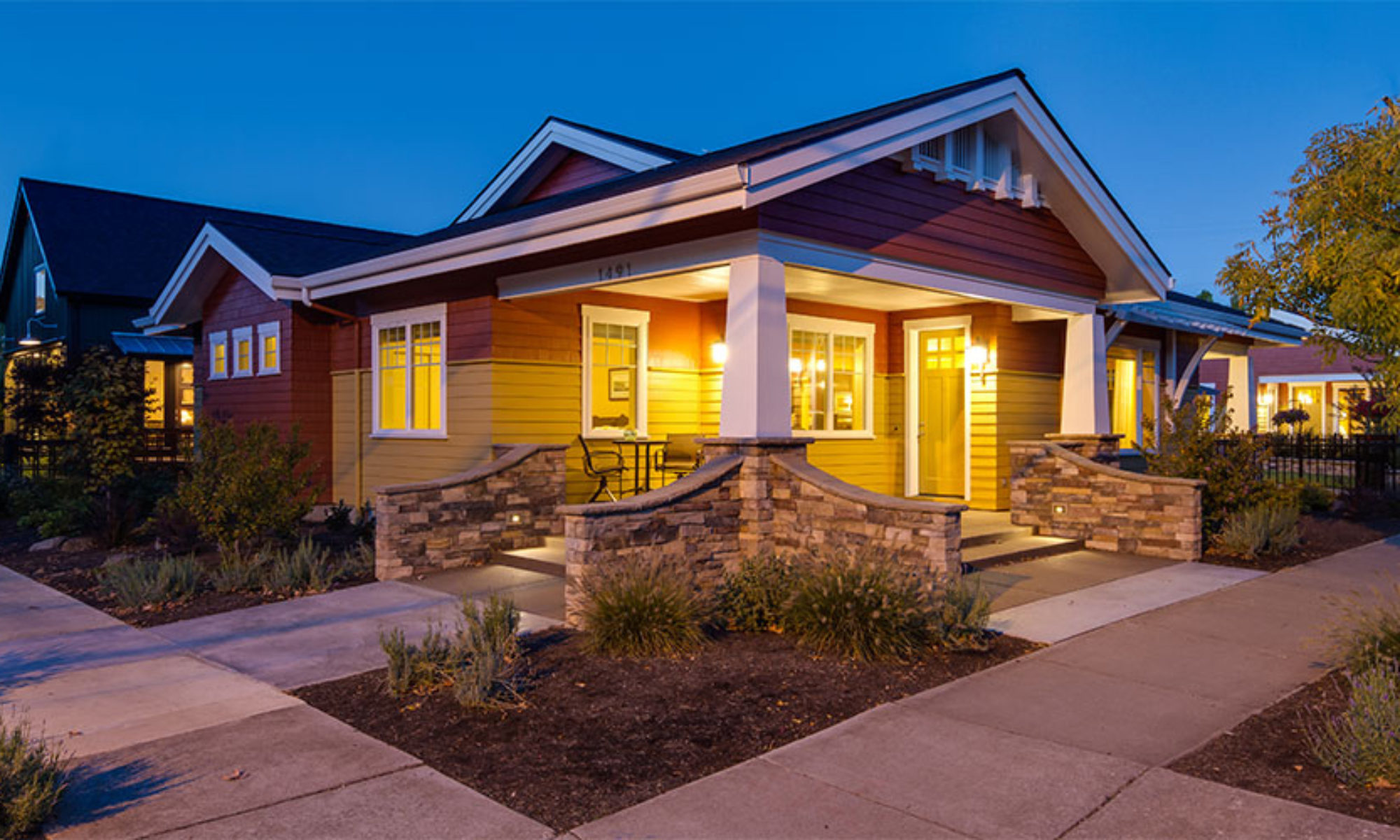
So we wanted a place that relates our home design to the street. We found a picture of an old bungalow house that had kind of a corner wrap-around porch. That concept stuck with us. Since our lot is a corner lot, this orientation seemed to make all sorts of sense.
So here’s the result. We have a nice corner porch, south-facing, with room for a couple of chairs to sit out and drink coffee and watch the neighbors walk by. It has what we envision to be a gently curved roof to provide visual interest from the street and protection from the rain as people come to visit. Right now, we’re showing a short sidewalk to each street: Lawrence and 15th.

The Lawrence Street House – Denofficebedroom


See, I got the title down to one word. In our plan, we have this room right off the living room. It’s one of those multi-use use rooms that help save money, space and consumption. Our three bedroom house won’t have the third bedroom sitting vacant all the time.

DEN/OFFICE: This will be the primary use for us. With both kids out on their own, this will be our home office, pay the bills area, surf the internet, play TextTwist or read a book. There is room for Brenda and I to both be here together. And with the nice south windows looking out to our front porch, it should be a pleasant space to be.
BEDROOM: The sofa you see there is actually our futon. We’re planning on reusing virtually all of our furniture and our futon is no exception. We bought it when we remodeled our Breezewood house in 1994. It’s relatively comfortable for what we’ll use it for and, with a fresh coat of paint about 6 years ago, it’ll be just fine. Since we have an actual guest bedroom with a “real” bed, this room, when used as a bedroom, will likely be for smaller grandkids (when they come). There’s a small closet.
You’ll also notice the large sliding doors to the living room. We did a similar “barn door” concept in theSAGE to separate the master bedroom from the living area. It was a big hit and we loved it, too. So we thought we’d do something like that here on Lawrence. The idea is that the Den will be open to the living area probably about 99% of the time. These doors will probably have some sort of artwork mounted to them. When the grandkids come and need a place to sleep or an area to watch a movie, they can go in the den, close the doors, adults can be in the living area and it works. The “back door” gives easy access to the bathroom at all times.
This room is small, but is as big as it needs to be. That’s something we’re wanting to get away from: big for the sake of big.