The Lawrence Street House – Front Porch continued…

I know it’s been a while since my last post. There are a couple of reasons for that. First, I’ve been in the final stages of completing my Sustainable Building Advisor class and the last part of the class got even more intense. Second, we’ve been also finishing the working drawings so we can get bids and find out just where we’re at on our budget.

In this post, I want to kind of tag on to my Front Porch article previously in April. This has been a huge part of my wife and my personal culture shift and paradigm that it became a major part of our design. It is also a major part of our landscaping layout. Thankfully, our landscape architect, David Dougherty (Dougherty Landscape Architects), who designed our landscaping in our present house 11 years ago was called into service to design our new one. David understands our desires (our current landscaping is incredible), sustainability and front porch philosophy.
Because our house faces probably the major bike and pedestrian east-west connection through town, we wanted to have our house relate well to that. It’s interesting that our City code allows us, because we are on a corner lot, to pick one side as the “front” and the other one as the “side”. This means, if we wanted to, we could build a 6′ high, solid wood fence the entire 150 foot length of our lot along this wonderful ped/bike corridor. Real neighborly, huh?
Of course, that would be totally contrary to what we envision for this house. We want to be part of the neighborhood, not project this idea that “this is my space; stay out.” Yet, because we are on a major circulation path, we do want some level of privacy for our outdoor living space. From the street as well as from the secondary home. Therein lies the challenge.
And David met that challenge. The image above is a segment of our conceptual plan, showing the porch and the yard. You can download a full size plan by clicking here, but I want to focus my discussion today on just the front porch and the yard.
I’ll start with the yard first. As I said, we wanted some level of privacy when we’re out having a barbecue or family gathering. After all, this is a major circulation path. Not a wood fence or hedge of arborvitae. This isn’t a major path for cars. We were mowing our lot the other day and in a fifteen minute period or so, I counted 22 bikes, 6 pedestrians and 2 cars passing by. So sound privacy isn’t much of an issue. We also don’t want to be completely on display. David captured that essence wonderfully and we are now taking this conceptual plan to that next level with only minor changes. We are reducing the lawn size even more (that IS our only lawn area — about 250 sq ft on a 9,000 sq ft lot) and providing some more patio for our outdoor table, chairs and umbrella. I’ll go into more detail as this progresses in a later post.
If you’ve read my April post about front porches, you’ll understand why our front porch is the way it is; if you haven’t read it, do that now, then return to this spot. We are envisioning some stone insets between the porch steps and the sidewalk wrapping around the corner. This allows people to cut the corner walking from 15th to Lawrence (they will anyway, so why not go with it?) and makes a hugely-inviting “front” to our home. My wife and I can see ourselves sitting out on the front porch on a Saturday morning, greeting passersby and maybe even inviting them up for a cup of coffee or ice tea (if summer ever arrives…). Neighborhood is all about this interaction and that is some of what we’ve lost in our recent trends in house and subdivision design.
That’s probably enough information for anyone to process in one sitting. As I mentioned, I’ll talk in more detail about some of our other landscape ideas later.
But this parting thought: most people design a house, get everything done, sometimes even start construction, THEN think about colors, plants, patios, etc. It needs to happen sooner, in this earlier stage of design, so the indoors and outdoors have some cohesive connection (and so it fits into the budget). Good design is comprehensive.
The Lawrence Street House – Refinements Pt 2

We have refined the exterior as well as the floor plan and are now very happy with every aspect of the design. Click here for a larger image of the south elevation.

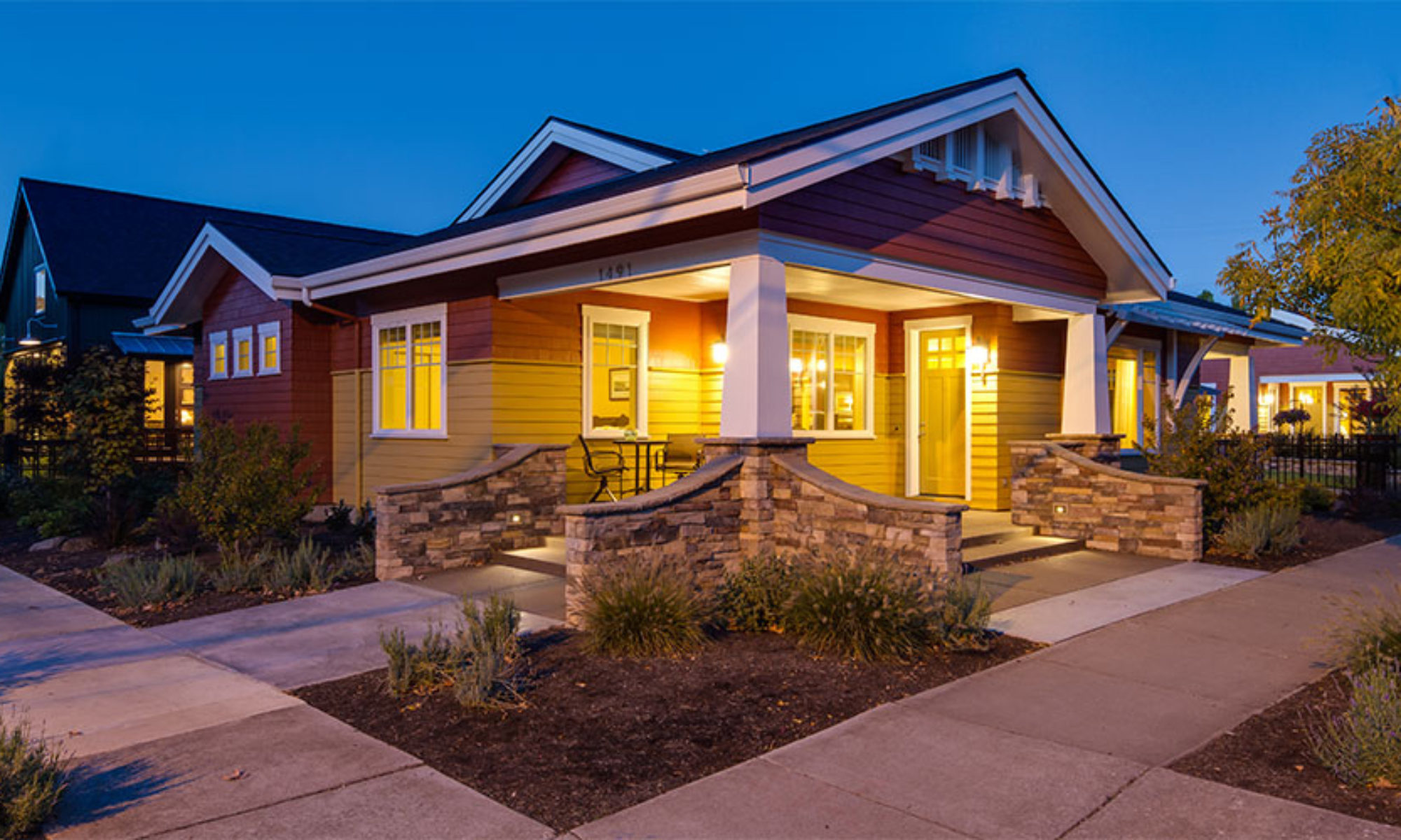
We’ve added arbors over the south windows at the living room and over Brenda’s potting bench area off the garage. The front porch is reminiscent of the Craftsman Bungalow houses from the early 1900s. We want to blend in with the rest of the neighborhood. We also want to capture the front porch concept that is missing in our culture. More on that later; this is something stirring deeply in us.
I’m also meeting in a couple of days with our LEED Rater to get started on our LEED certification. And, I’m now starting on the design for the Secondary Dwelling Unit that will be located along 15th by the alley. More as that progresses, too.
We’re getting more and more excited about our new home!

The Lawrence Street House – Design Development

>Well, the charrette spurred some creative juices, as I mentioned. I’ve spent the last few days refining some things and developing the plan a little further. Refining it a little more. Tweaking it. Making it better.

The last sketch was an exterior idea, very rough. I’ve refined it a bit more and put a little color to it. Amazing what the 3D modeling, sketch paper, a little PhotoShop and some time will produce.
We’re actually, day by day, getting more stoked about our new house. The way it is coming together, the refinements and the minor changes that lead to continual improvements, is amazing.
I mentioned in an earlier post about how well this sort of design process works. It is proving to be true… again.
Our thoughts on the exterior are grey shingle siding above a golden stucco base. That may change when we get down to the final design, but is what we’re going with for now. I’ve also made a few changes to the interior plan — main bath, utility core and den. I’ll post those soon.
I think we’re getting close to jumping into working drawings and details. Just a little more refinement and we should be there.

The Lawrence Street House – Front Porch

This post is Front Porch because we also have a Side Porch I’ll talk about in a future post.

Part of our desire to be downtown is neighborhood. Connecting with people and the whole aspect of our culture that we’ve lost in the suburbs. We’ve noticed, when walking around this neighborhood that people are out front. 15th Street is a major bike and pedestrian connector with more bikes than cars, I think.
So we wanted a place that relates our home design to the street. We found a picture of an old bungalow house that had kind of a corner wrap-around porch. That concept stuck with us. Since our lot is a corner lot, this orientation seemed to make all sorts of sense.
So here’s the result. We have a nice corner porch, south-facing, with room for a couple of chairs to sit out and drink coffee and watch the neighbors walk by. It has what we envision to be a gently curved roof to provide visual interest from the street and protection from the rain as people come to visit. Right now, we’re showing a short sidewalk to each street: Lawrence and 15th.

The Lawrence Street House – Denofficebedroom


See, I got the title down to one word. In our plan, we have this room right off the living room. It’s one of those multi-use use rooms that help save money, space and consumption. Our three bedroom house won’t have the third bedroom sitting vacant all the time.

DEN/OFFICE: This will be the primary use for us. With both kids out on their own, this will be our home office, pay the bills area, surf the internet, play TextTwist or read a book. There is room for Brenda and I to both be here together. And with the nice south windows looking out to our front porch, it should be a pleasant space to be.
BEDROOM: The sofa you see there is actually our futon. We’re planning on reusing virtually all of our furniture and our futon is no exception. We bought it when we remodeled our Breezewood house in 1994. It’s relatively comfortable for what we’ll use it for and, with a fresh coat of paint about 6 years ago, it’ll be just fine. Since we have an actual guest bedroom with a “real” bed, this room, when used as a bedroom, will likely be for smaller grandkids (when they come). There’s a small closet.
You’ll also notice the large sliding doors to the living room. We did a similar “barn door” concept in theSAGE to separate the master bedroom from the living area. It was a big hit and we loved it, too. So we thought we’d do something like that here on Lawrence. The idea is that the Den will be open to the living area probably about 99% of the time. These doors will probably have some sort of artwork mounted to them. When the grandkids come and need a place to sleep or an area to watch a movie, they can go in the den, close the doors, adults can be in the living area and it works. The “back door” gives easy access to the bathroom at all times.
This room is small, but is as big as it needs to be. That’s something we’re wanting to get away from: big for the sake of big.

The Lawrence Street House – Plumbing

One way to save energy is through a compact plumbing design. One of our goals as we laid out the design was to keep the plumbing — especially the hot water runs — as short as possible.

I shared that goal with a friend in the design community who said we wouldn’t be able to do it. And I’ll have to admit, this was one area where we had some struggles.
It wasn’t that easy. We could group the bathrooms and the utility room, but the kitchen sink seemed to be the sticking point. And, we had thought about a sink in the garage for clean up when working out in the yard.
Well, after many iterations of the layout, we came up with the design you see above. I think we’ll be able to get all hot water plumbing runs within 20 feet of pipe from the water heater. This will reduce pipe heat loss and also reduce water use because we won’t be waiting and waiting and waiting for the hot water to hit the faucet or shower head. Plus, we have grouped the major hot water uses, the washer, shower and tub all very close to the water heater.
Couple that all with low flow faucets and shower heads and you can see why this will save energy and water. So about the sink in the garage… You’ll notice there isn’t one. By designing the layout so we can come into the utility room from the garage, we can use the sink in there. Plus, if we need to remove dirty clothes, we have a private place to do that without tracking dirt throughout the house.
We’ve saved the cost of a sink (and the associated plumbing), doubled up on use (utility room doubles as a clothes changing area) and kept the plan even more compact. We took a similar design track in the kitchen for my espresso maker and bar sink: no bar sink. We grouped the espresso maker location close to the main sink and I’ll simply use that one. Again, we saved a sink.
And, by the way, we’ve been appreciating your comments about the design. We are compiling them and will respond as we go through some of these details. For Sue, on connecting the master bath to the utility room, we thought about that; but our lifestyle is such that it isn’t a major thing for us and the clean clothes. We do have the double-rolling hamper from the utility to the master bath (It’s between the ironing board and the utility sink).
Bryan commented about the master sinks on the exterior wall and the venting, etc. In response to Bryan, with our exterior wall system (I’ll go into more detail later), we will actually be building two 2×4 walls with a 1″ space, then foaming it all with insulation. This keeps all the plumbing on the warm side, completely seals it with insulation and still keeps the sinks close to the hot water heater. I plan on running the vent up the interior wall by the shower.
This is one area where we kept the dual sinks. Brenda and I “need” two sinks… 🙂

The Lawrence Street House – Schematic Pt 2

As we started the design, we looked at our relationships of rooms to each other (from our notebook), the aspects of the rooms we wanted (the den needed to also double as a guest bedroom) and the relationships of all of this to the outdoor living areas of our lot and our relationship to the neighborhood.

You really can’t initially take just one thing and focus on that. Good design needs to be comprehensive. We’re going for LEED certification (targeting Platinum again!) and even LEED recognizes this. I think I’ve mentioned before in this blog (or my other blog): everything is connected. And that applies to the design, too. How and where we place the kitchen affects the rest of the house and affects how I barbecue in the summer months. The shape of the house plan affects the rooflines, which affects the ability to install solar panels. The location and shape of the garage affects the location and shape of the rest of the house. Where the basic “mass” of the house sits affects whether or not our patios get good sun (important to us) or are constantly in the shade (not good in Oregon).
We start pen on paper, freehand, rough and only generally to scale. This first part is more organizational. What rooms are generally where and how the overall flow and circulation might work.
The lot is narrow (60 feet) and, with the interior yard setback (5 feet) and the street setback (10 feet), we only have 45 feet to work with. The one aspect of our design I will focus on today is the garage and its relationship to the house and its shape. As has been the case for many years, our mindset is a 2- or 3-car garage. That’s been our culture. We, obviously, aren’t thinking a 3-car garage here, but we have settled out that even with our walking and bike riding, we want space for 2 cars.
In the normal mode of thinking (which we’re trying to change), that’s at a minimum 20 by 20 foot box. And with only a 45 foot wide building area, that can dominate the design. So how to get around that? Even with our alley access, that size box fills up our yard area. So do we want yard or garage? Can we have both?
This calls for thinking outside the box (pun intended). Appropriate, since the garage is usually a box. So we thought, could our lifestyle accept an end-to-end arrangement for the garage? Then the “box” is more like 12 feet by 40 feet (and that sets up visual issues we’ll address later), we have a smaller garage door, which lessens the auto impact, even though it’s facing the alley, and seems like it will fit our lifestyle.
The picture above is our first iteration (north is up — north is always up). The house basically is at the southwest corner of the lot, garage along the north and accessory dwelling unit at the southeast. This leaves a nice south and east facing area for patios. This gives us a more “square” arrangement for the heated part of the house (more energy and material efficient) and a much nicer yard area. The rooflines seem like they will work well this way, so we’re going to develop this a little further.

The Lawrence Street House – Schematic Pt 1

We’ve started the design. After we synthesize the notebook (it’s good to organize your thoughts, even when designing your own home), we started sketching. I plotted out a scale site plan with the surrounding houses, trees, streets, etc.

Making note of the site analysis information and thinking about the factors that arise in that process, we can actually start designing the house. Finally. Most times, we as architects meet with our client and go over their notebook. We try to “get into their head” as to what they want, what the pictures and descriptions they’ve compiled actually mean. If they’ve done a good, comprehensive job on this, our job as an architect is much easier.
We have also owned this lot since last summer. So we have taken bike rides past our lot, stopped and just savored the neighborhood. We’ve eaten at our favorite restaurant (just three blocks away) and walked around the neighborhood. We’ve become intimately familiar with this piece of ground near downtown.
I’m also in a bit of a unique situation since this is my house and my wife and I are the clients. So this process is a little different. As I mentioned in my earlier “programming” post, my wife has really good ideas — some I haven’t thought of. So when the time came to sit down with pen and paper, she sat with me, too.
And, yes, this techno-geek-early-adopter still designs with pen on paper. As much as I’d like to go paperless, and I do in many areas, when it comes to the free flow of ideas in an initial design of a house, pen and paper is still the best.
We sat down for an uninterrupted afternoon, looked through our notebook again, talked about the surrounding aspects of the lot we’ve now owned for about 6 months and started.